
Are you using Colour Theory in digital signage design correctly?
Using the wrong colours in your digital signage content can be disastrous. Your designs may look bad, but more importantly, your audience may not be able to read your messages! Using the correct colours is key in ensuring that your messages are clear, and “pallette-able“. (See what we did there?) Clear messages will lead to more engagement.
In this blog, we take a look at how you can use Colour Theory when designing your digital screen content.
What is Colour Theory
According to the Interaction Design Foundation, Colour Theory relates to a number of rules or guidelines around using colours. These rules and guidelines help designers to pick the colours and use them effectively.

The wheel above shows the relationships between primary colours, secondary colours and tertiary colours.
The primary colours are red, green and blue. These are key as they’re fundamental to human vision.
Secondary colours – combining two primary colours to make further ones. Examples are purple, orange and green.
Tertiary colours – an equal mixture of a primary colour with a secondary colour adjacent to it on the wheel. Includes rose, violet, azure, spring green, chartreuse, and orange.
The 4 main Colour Theory Concepts
A quick note – colour is so significant to the human mind. It can work particularly well when businesses like yours are attempting to provoke emotions. For instance, you could create emotions of excitement, peace, creativity, and so on. And using a combination of these colours can have a great effect.
When it comes to digital screens you might what to consider how the colours will make your audience feel or react. Maybe you want to create a sombre mood or drive awareness to certain things. If you wanted to create a welcoming atmosphere then you might look at using warm, harmonious colours. Whereas, if you wanted to drive awareness to a certain area of your display to catch attention then you might want to use contrasting or split complementary colours to highlight certain parts. (We’ll get to these soon).
There are 4 main Colour Theory concepts for Digital Design that you should know about, so let’s talk about them.
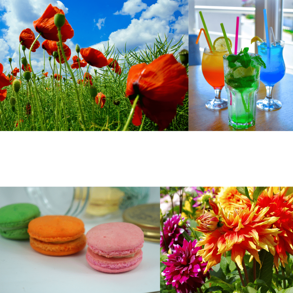
1. Harmonious colours
- Harmonious colours sit beside each other on the colour wheel. These colours work well together and create an image that is pleasing to the eye as it’s very easy to create a balanced, unified scheme.
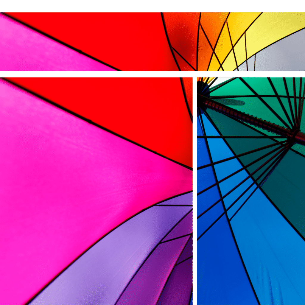
- The collage above show some good real life examples, using the theory. The diagram below shows the relationship between colours beside one another – in this case, we highlight red, orange, and yellow. Other examples include pink, purple, and blue together. (Fun-ish fact – analogous colours are groups of three colours that are next to each other on the colour wheel).
Harmonious colours for Digital Signage
- What for: welcoming people in to store front, mental health, for internal comms/patient comms
- Connotations: sense of peace, warmth, harmony
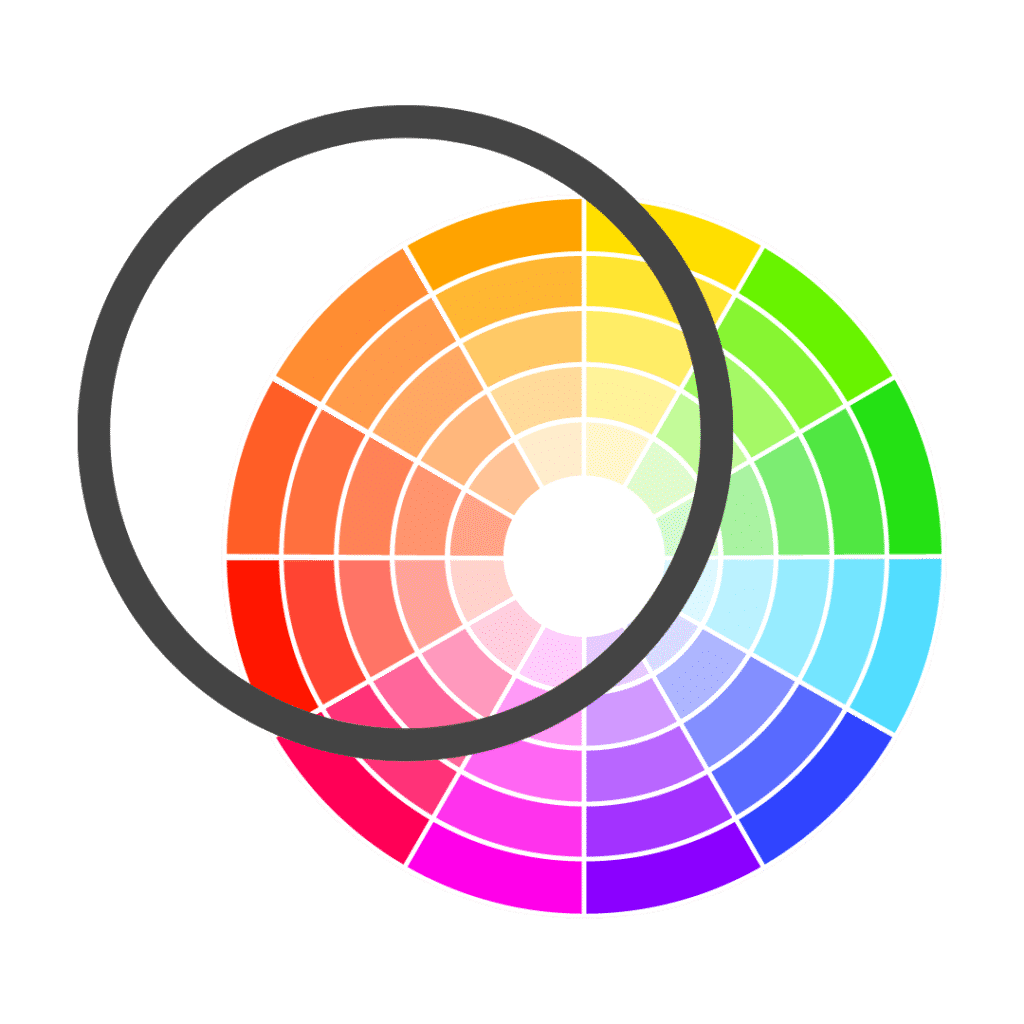
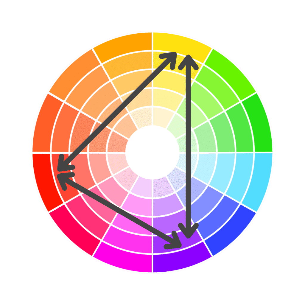
2. Contrasting Colours
Contrasting colours are those that are directly opposite one another on the colour wheel. These pairs have the highest contrast possible, while colours next to one another have low contrast. There is a colour contrast rating to check for this too. Examples of this are yellow/purple and green/red.

The image above shows some examples of how to use contrasting colours. It also shows how you should consider what content you’re using as to how to use colour. Some are much harsher and more defined than others. Compare the top images, while using the same colour palette, they each have different vibes and focal points.
The diagram below shows how the colours opposite one another are highly contrasting.
Let’s jump into signage:
- What for: good to be used – whether that’s a CTA, time limited offers, or vivid branding.
- Connotations: using contrasting colours will help you to spark interest and highlight certain things.
3. Split Complementary Colours
Split-complementary colours is a scheme that uses a base colour and two secondary colours (similar to the complementary), but one of the complements is split. Confusing, we know – it’s probably easier to understand it from looking at the image. They can have so many combinations.
What for: general designs. eg background text & highlight.
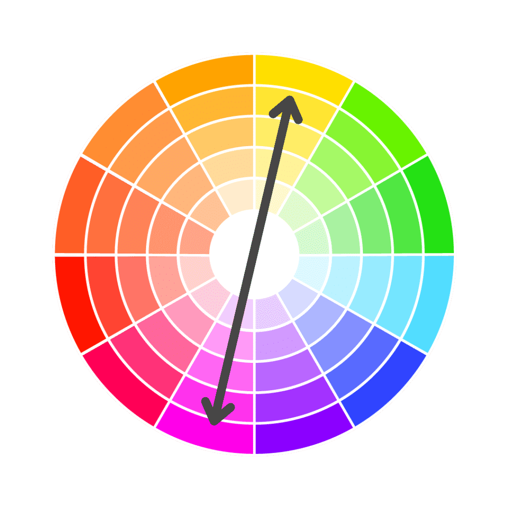
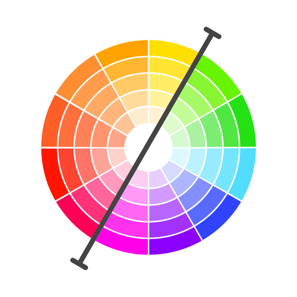
4. Warm and Cool Colours for Design
Finally, Warm and cool colours – depending on what vibe you’re aiming for in your designs, think of the colours you’re using. The warm colours are normally your reds, oranges, and yellows. They are used to create a cosy feel. Cool colours include blues and greens which could connote sadness or energy. Also, think about the connotations of the colours. Here’s another thing to note – think of using dark grey instead of black to make the imagery less harsh, it can also destroy the hues of a palette. Dark shades are normally used as background colours to allow for the contrast of bright text/images.

The diagram below shows the split between warm and cool colours. On the left of the line, we the warm colours – reds, oranges and yellows. On the other hand, on the right of the line, we have cool colours – pinks, purples, blues, and greens.
Let’s talk about Signage.
Cool –
- What for: limited time offers, calls to action, grabbing attention
- Connotations: reserved, relaxing calming. Trustworthy & harmonious. positivity, tranquillity. positive energy
Warm –
- What for: used a lot in rooms that see a lot of activity like kitchens/dining rooms
- Connotations: postivity, intense emotions of passion, joy, playfulness. Stimulating.
According to Adobe Marketo, when it comes to brand colours, blue seems to be the winner. It appears in 33% of the top 100 brands. Red comes second at 29%, black or greyscale is third most popular with 28%, and 13% use yellow or gold. 95% of the top 100 brands only use one or two colours. This can be explained as an attempt to maintain consistency by staying simple in their branding.
A few considerations
When choosing what colours you want to use on your designs there are some considerations you can make to set you on the path to success.
- Where is your screen?
- What’s the purpose of it/what’s your message?
- Who’s your target audience? (eg Internal comms, hard-to-reach/desk-less or desk-based staff, marketing to the public, health and safety)
- How do you want the audience to feel/act?
- Colour blindness?
- What needs to stand out?
- On brand?
What now?
Think about how you can use Colour Theory for your digital signage design. Have a play around with different colours depending on your goal of the creative and message you’re trying to send.
Things to think about – if it’s a sensitive topic, try to use warm, harmonious colours. Whereas, if it’s an attention-grabbing sale that you want to promote, then use contrasting colours for elements to stand out.
For more on designing content, check out our Canva guide. and why not follow us on our socials like LinkedIn, we’ll be pushing out more content to give you some inspiration!
If you have any questions about using Colour Theory with digital signage, speak to us using the button below.